
One easy and inexpensive way to create flow in your home is to use the same color palette throughout. I have been neglecting our home office, well, I guess it’s been for a couple of years now. I finally got around to coordinating our office colors with the rest of our cottage. Whether it’s blues and greens or whites and neutrals, using similar colors from room to room will be pleasing to the eye and help create a nice flow throughout your home.
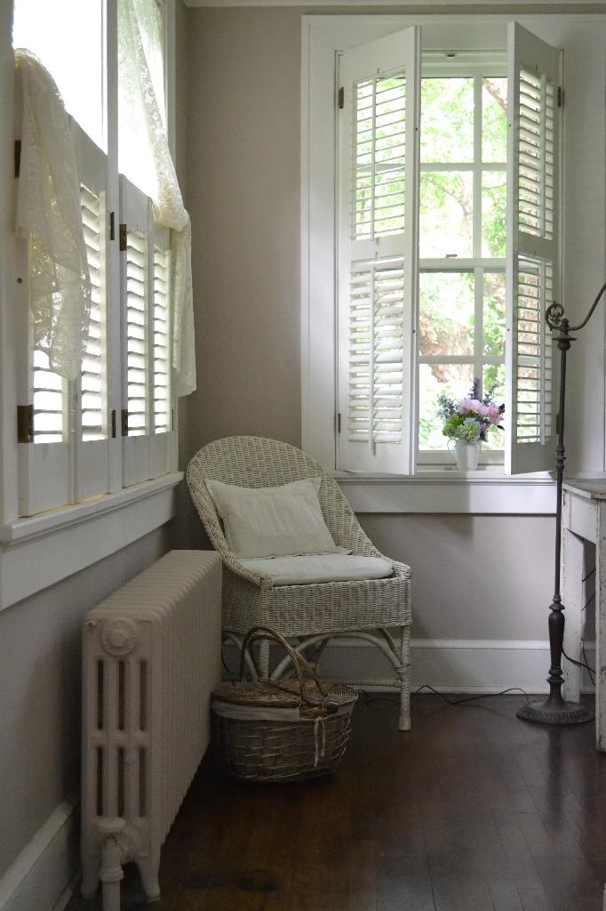
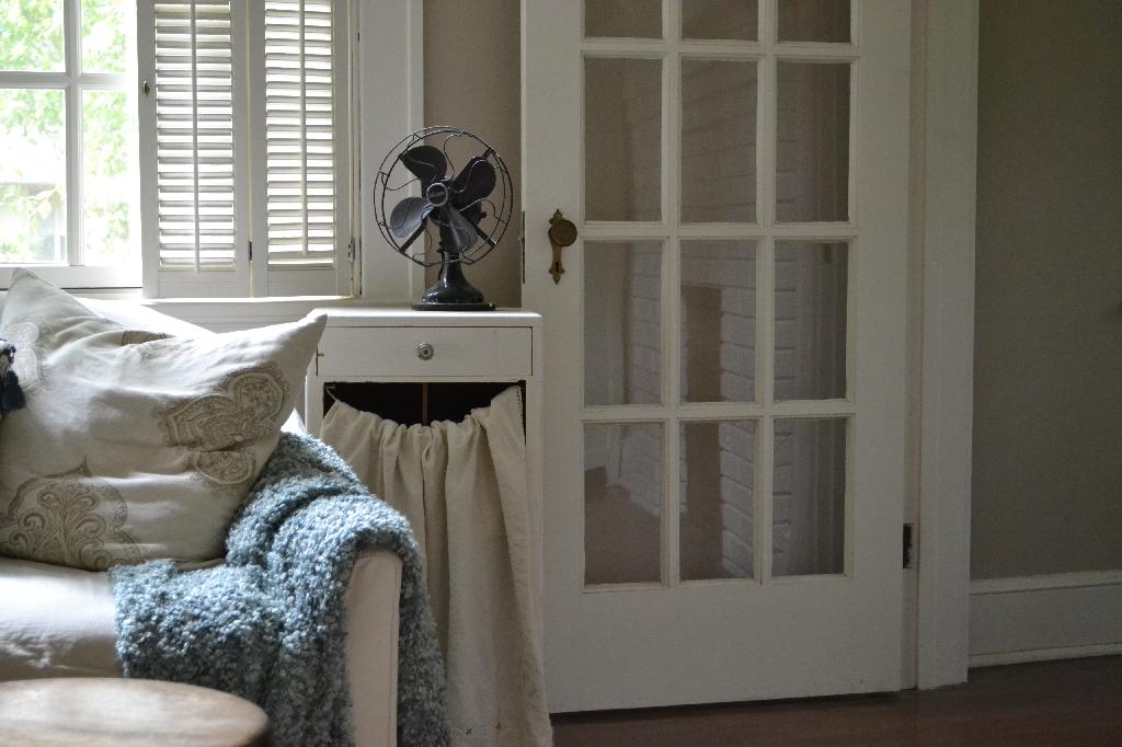
Almost our entire first floor, now including the office, is taupe with accents of whites, blues, greens, and shades of raspberry. I haven’t gotten around to painting the sun porch or the family room yet. They are both gray and I’m planning on painting them both soft white. I found a distressed green and white farm table that we use as a desk and it fits in well in our office. I also decided to paint the office radiator the same shade of taupe as the walls so it blends in.

The wall colors of the living room and office are the same shade of taupe. This creates a nice continuity between the two rooms. Of course, it is certainly not necessary to paint the exact same colors like I’ve done here, but to choose colors that create a relationship between the rooms. A blue or green would have also worked well for the office wall color, and would have brought out the blue accents in the living room. But, I’m a die-hard taupe girl.
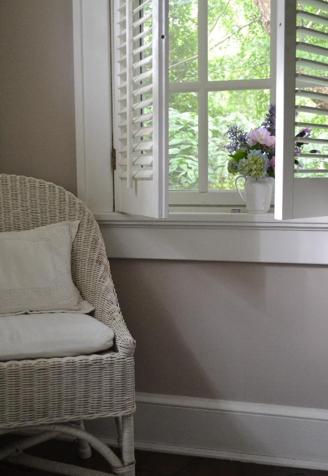
The trim is painted soft white throughout our cottage — this is another way to create continuity. The white is carried onto the shutters. In this little corner of our office the green in the desk and the garden bouquet add a hint of color.

Our cottage is quite small so I used the same color – Provence yellow by Benjamin Moore in every room. I like the continuity.
I spotted an old chippy table – love it!
I love your paint colors. I’m looking for the “perfect” color for my living room / dining room. What colors are your taupe and white? I love them!
Hi Kathleen, Thanks so much! The taupe is Pavilian Beige by Sherwin Williams, it took me a few tries to get it right. The white trim was here when we moved in so I had a color match done. The paint clerk thought it was most likely Dover white. Good luck with your paint job!
Sally